The colors you surround yourself with can affect your state of mind.
Excitable red, calming blue, optimistic yellow, regal purple—it’s true. The colors in your life have an impact on mood—even to the point that they can stimulate or depress your appetite.
Nowhere is color’s impact more apparent than in your home, where the paint on your walls can quite literally bring you such emotions as comfort, cheeriness, serenity and wellbeing. The colors you select for wallpaper, flooring, draperies, bedspreads, cabinets, countertops and molding have similar potential to shift your mood. Here are some interesting tidbits about how the colors you use in your home can improve your state of mind.
Calming Colors
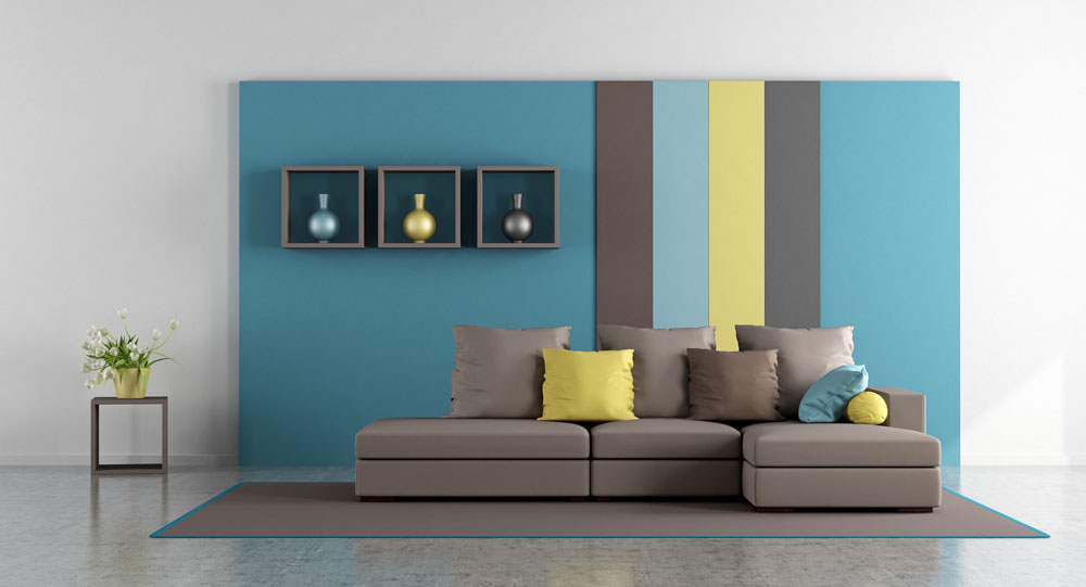
Several colors are associated with peace and serenity, thereby offering a welcome retreat from the stimuli of the outside world. Blue is among the most soothing of colors. Think of the gentle waves of the ocean, the sky on a cloudless summer day, or the eyes of a newborn baby. The emotions that blue evokes makes it the perfect color for a bedroom, a master bathroom or a quiet nook for reading and meditating. And if you have a beach house, a blue motif works well throughout the home as a compatible décor for your surroundings.
Another color that lifts your mood is green. Just think about days spent in your garden or walking through a local park. The greenery of the grass, trees and foliage helps you feel more refreshed and can actually alleviate stress. Using green in your decorating—whether paint on the walls, an area rug on the floor or plants near your windows—is a great way to feel better about life.
Other colors that offer soothing qualities are neutrals such as gray, beige, taupe and off-whites as well as pastels such as light pink, soft yellow, mint green and a whispery lavender. Warm wood tones also offer a sense of coziness and serenity.
In the Pink
Are you looking for a color that reduces negative emotions? One color that has been scientifically proven to do so is pink. In fact, color researchers in the 1970s conducted an experiment using pink to calm angry and antagonistic behavior among prison inmates. They painted the walls pink, which produced a calming effect (though the effect did lessen once the inmates got used to the color).
In small doses, pink can be a wonderful color in many areas of the home—not just for baby girl nurseries but for older girl bedrooms, powder rooms and guest bedrooms. If you want to tone down the pink, you can pair it up with other colors like gray, teal, bright red or orange.
An Appetite for Color
Ever wonder why fast-food restaurants use so much orange and red in their signage and décor? Why, to stimulate your appetite, of course. Those marketing experts don’t miss a trick!
Color researchers have known for years that reddish hues are more conducive to a healthy appetite. Conversely, blue is an appetite buzzkill. Good thing to know if you’re dieting! But it’s also good to know when considering colors for your kitchen or dining room. If you want your casserole surprise to delight the taste buds of family and friends, any other color but blue is the way to go.
Size is Relative
Color psychology isn’t only about hue but also about lightness and darkness. Light colors can make a small room feel more spacious, whereas dark colors can make a cavernous room seem smaller and cozier. Your eye plays a helpful trick to change your perception of the space, but the colors also evoke a certain psychological feeling that can change your mood when entering a space where the size might otherwise be confining or intimidating.
Excite Your Surroundings
Being calm, peaceful and serene is all well and good, but sometimes you need a little excitement in your life. Red is a color that experts associate with energy, excitement and passion. Orange is similarly a color that pumps up the energy in a room. For your home, you might want to use these colors in small doses for accents, accessories or focal walls. Or you may wish to get bold by using the colors in an area where a lot of energetic activity is taking place, such as a rec room or a man cave.
A word of caution, however: It’s best to avoid the most intense of these colors if you’re prone to stress, since colors like red have been clinically proven to increase adrenaline.