5 ways to spruce up your apartment


You’ve discovered the perfect apartment—or at least as close to your ideal as you’re likely to find. Now it’s time to make it your own with equal dashes of functionality and flair. Even in a small apartment, you can go big on style. Short of knocking out a wall or replacing the kitchen cabinets, you have plenty of options to add personal touches.

Apartment.jpg


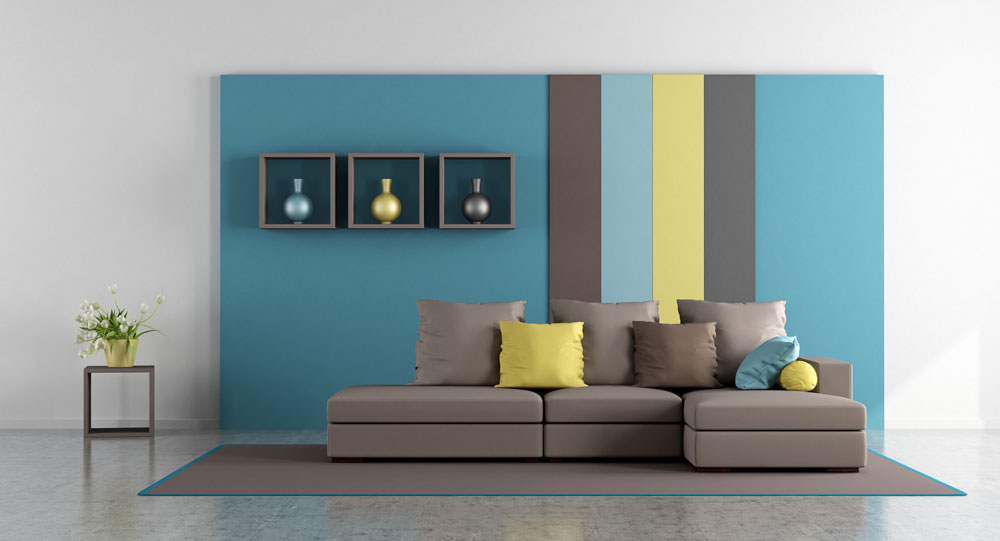
1. Make a statement with color. Set the tone with a palette that unites and accentuates. One idea is to start with a prized possession—a comfy chair or gorgeous table lamp—and build your color scheme around it. For a smaller space, a couple of light-and-bright shades with a darker accent color may work best. Painting the walls might not be an option, but you can paint your furniture to bring the décor together—or in a range across your chosen palette to delineate distinct areas in an open-concept layout. Removable wallpaper, murals, and decals can also add dramatic statements. New peel-and-stick products are easy to apply (and remove), and they range from realistic brick and barnwood finishes to eye-catching geometric patterns and whimsical prints.  


2. Define your living space. If most of your apartment is one big room, then you can simultaneously embrace the open space and stake out entry, dining, living and sleeping spaces with strategic placement of furnishings. To create a welcoming entryway, position a hall tree or a tall shelving unit refashioned for functionality: Replace the upper shelves with coat hooks around a mirror and place square baskets in the lower shelves to store hats, sunglasses, and shopping bags. A cupboard or buffet can help define the dining area, extend kitchen storage, and provide a serving surface. A swag light over the dining table will set this space apart from the living area with its own distinctive lamps. Area rugs can also designate zones, complement color themes and (bonus!) hide worn carpet or floorboards. In a studio apartment, position your couch or a couple high-backed chairs with their backs to the foot of the bed to delineate the sleep space.  


3. Add smart storage. Shelving choices abound to reduce clutter and set off your décor, from tall industrial-style metal units to wooden bookshelves to floating shelves on the walls to display framed art, photos, and small knickknacks. Look for coffee tables with storage shelves or drawers. Stick a wicker hamper or stackable wood boxes in a bare corner to store linens. Let no space go wasted.


4. Dress up the windows. Make the light through your windows a focal point of your living space with colorful curtains or a curvy valance to cover bland miniblinds when they’re not in use. With a simple rod and curtain hook rings, you can hang any type of fabric. Base plant choices on the available light to create an indoor garden, and position your table or desk accordingly if you’ve got a room with a view.


5. Nurture your inner neatnik. The smaller the space, the more quickly messes can pile up. To live comfortably in a small space—and show off the style you’ve worked so hard to achieve—develop the habit of putting things back where they belong and decluttering regularly. You may not be able to call your apartment spacious, but with a little planning and ongoing maintenance, you can declare it just right.

How to remove wallpaper

The words “wallpaper removal” can send a shiver up the spine of even the most ardent do-it-yourselfer.

Fortunately, many new wallpapers are printed on nonwoven substrate, making both hanging and removal easier than ever before, and some older wallpapers are peelable and strippable. (“Peelable” means that you can remove the decorative layer of the paper by pulling at an edge.) Typically it will come down in large sheets, leaving the plain wallpaper substrate behind. You can leave the substrate in place if you’re hanging new wallpaper. Otherwise, you’ll need to remove that as well. If it’s dry-strippable, you’ll be able to pull it from the wall with relative ease.

If your wallpaper doesn’t come off with dry peel or strip methods, it’s time to look at wallpaper removal products.

Various chemical products are available, including liquids and gels, ready-to-use products and concentrates. Ask a salesperson to help you select the best product, and follow the directions on the label. Here are the general steps:

1. Protect your floor with a dropcloth.

2. Perforate the wallpaper with a scoring tool. These tools are designed to not damage the wall, but don’t press too hard—just enough to perforate the wallpaper.

3. Apply the remover to the surface in accordance with the label instructions. Wait the specified time (usually about 15 minutes) to allow the paste to loosen.

4. Use a wallpaper scraper to remove the wallpaper.

5 Repeat steps 3 and 4 until the paper has been removed and the paste residue is gone.

6. Clean the wall thoroughly, using a sponge.

Another option for removing wallpaper is a wallpaper steamer. There are no chemicals, and they’re especially good for removing multiple layers. You’ll need to pre-score the wallpaper for the steam to penetrate the wallpaper. Carefully follow the directions to ensure safe use, and be sure to wear the appropriate protective gear. Also, use caution around power sources; manufacturers recommend that you completely turn off the power to electrical outlets and light switches when steaming off wallpaper around them.

How traditional color pairings continue to evolve

Some fashions are meant to go together: the little black dress and high heels, Italian suits and silk ties, oxford shirts and pullover sweaters. The same is true of home fashion. Some color combinations—blue and yellow; green and pink; purple and brown; red, black, and white—are longtime partners that show no sign of splitting up soon.

These color combos have staying power for several reasons. They tend to be complementary on the color wheel and are soothing to the eye. They’re also naturally comfortable together; most are found in nature. Many classic color combinations are also linked to iconic images in culture. Blue and yellow? Vintage china patterns. Green and pink? English gardens. Purples and browns? Autumn flora and fauna. Red, black, and white? The American diner.

Though these classic combinations may be here to stay, they’ve been updated this year.

Take blue and yellow. Some of the top blues aren’t “true blues” but instead are blue-greens that are hard to pin down. Are they teal? Turquoise? It’s hard to say, because these new blues have depth and complexity. They also pair well with the full range of yellows on the market, including sunny yellows, which remain some of the most popular colors in the palette.

Purples and browns likewise are becoming more complex, both now influenced by gray. In fact, several paint companies have placed smoky purple at the top of the 2017 palette in colors ranging from amethyst to violet. These new purples are beautiful complements to charcoal and graphite, as well as to metallic versions of those colors.

Greens and pinks, meanwhile, are everywhere, in permutations that include sage and salmon, celery and apricot, and lime and rose. These combinations are especially popular in fabrics and upholstery—retail stores are filled with floral patterns in these colors—and look both classic and modern.

And what about red, black, and white? They, too, are a little more complex these days, with red leaning toward orange, black toward gray, and white toward cream. But the original versions remain popular, too—and could become even more so as we head into 2018.

The type of stain on your deck has a lasting impact

Many homeowners have resigned themselves to the yearly ritual of staining their decks—but it doesn’t have to be that way. Know how to protect your deck by learning about the various types of stains. Though they vary slightly by manufacturer, there are specific categories, each of which has its own characteristics and longevity expectations. A rule of thumb: The more opacity to the stain, the more UV protection it will offer—and the longer you’ll be able to go between re-stainings. And remember that longevity varies with exposure to the elements, as well as with such factors as the stain’s quality and formulation.

Clears, Transparents, and Wood Toners: These products allow the maximum wood and texture to show through while offering protection against the elements. The lightly tinted transparents or wood toners add a very subtle color to the wood. They typically need to be reapplied every year.

Semi-Transparent: This popular stain has a light pigment that still allows the wood’s grain and texture to show through the color. Semi-transparents typically must be reapplied every one or two years.

Semi-Solid/Semi-Opaque: This type of finish features more color but still highlights some of the natural grain and texture of the wood. You can expect better life with this choice, typically three or four years.

Solid: This is the most opaque stain possible, hiding the wood grain but letting a bit of texture show through. Many manufacturers recommend using this option when your deck has reached the end of its life cycle and you want to hide imperfections. Some products are formulated to improve the look of worn or weathered wood. These products can last three to five years.

How nature is influencing color trends

When Pantone revealed that Greenery, a “fresh and zesty yellow-green shade,” was its 2017 Color of the Year, we knew that the pronouncement was indicative of a broader decorating trend: bringing the great outdoors inside. Nature’s hues have inspired consumers’ home decorating choices for decades in ever-evolving ways. Recall the earth tones of the 1970s, the Caribbean-influenced color palette of the ’90s—both nature-inspired but very different. This year’s palette uses nature in versatile, sophisticated ways to suit every type of décor, from traditional to contemporary.

Paint: The Color Marketing Group echoed Pantone’s sentiment regarding yellow-greens as a major trend in home décor. The colors named by these prognosticators bring to mind leafy and lush vegetation, adding zest to an overall gray-cast palette for 2017. Some of the other colors that paint manufacturers are touting this year are as clear as a cloudless blue sky, as deep green as a forest floor, as optimistic as a sun-kissed garden, or as deeply purple as a sunset fading into night.

Wallpaper: Nature is a major theme in wallcovering, not only in terms of color themes but also with regard to the use or replication of natural materials such as cork, sisal, and grasscloth. Floral wallpaper has been popular since it was invented, but state-of-the-art printing methods and sophisticated designs give florals an updated look. Wallpaper murals also tend to be natural in theme, whisking you away (figuratively speaking, of course) to a seaside cottage or a mountain villa.

Fabrics: This year’s fabric trends likewise feature natural hues and textures. Colors are somewhat earthy, and designs—even when nature themed—have a sophisticated, contemporary sensibility. As with wallpaper, floral designs are huge—and will continue to be so for the foreseeable future.

Window Coverings: Even though window coverings manufacturers have broadened their color selection, neutral colors continue to dominate in such categories as miniblinds and pleated or cellular shades. The influence of nature shows itself at the window with the continuing popularity of wood blinds—both real and faux—as well as woven wood shades and plantation shutters. Faux-wood blinds provide the desired natural wood at a fraction of the real thing’s cost.

Flooring: Consumers love the look of wood beneath our feet, so much so that a wood-like appearance isn’t confined to hardwood. Laminate flooring, vinyl tile, even porcelain tile are being fabricated to replicate the look of real wood. Real wood can be hard to maintain, so these trends give consumers the best of both worlds: the look they crave with minimal maintenance.

Quarters Spring-Summer 2017

The latest issue of Quarters Magazine is in!

Quarters is published by the Paint & Decorating Retailers Association (PDRA) and brought to you locally by Tommy's Paint Pot.  This issue is full of the latest color trends, including Benjamin Moore's color of the year for 2017.  Printed copies are available in our stores while quantities last, or simply use the link below for the electronic versions.  

To download your own copy, click here (20MB). Or you can peruse the magazine within your web browser below.

QUARTERS Magazine!

Introducing QUARTERS Magazine — a new publication from the Paint & Decorating Retailers Association (PDRA) which allows participating members to customize a high-end lifestyle magazine for their stores and customers. The content is of exceptional quality with beautiful and inspiring photography paired with expertly written articles to help you refine your sense of style.

This season's issue features Tommy's Paint Pot! Printed copies are available in our stores; we encourage you to drop in and pick up a copy for yourself, and perhaps a few extra for friends and family. We hope to continue to bring you QUARTERS Magazine up to four times a year, so sign up for our eNewsletter and don’t miss an issue. Please drop us a note at info@tommyspaint.com and let us know what you think of our magazine, or if you would like to distribute copies at your local office or place of business. Enjoy QUARTERS!

Preview the issue below or open for full viewing in a new tab.

Paint By Numbers

Summer is upon us, and it is time for exterior painting. If you have a project you’re considering, you are probably keeping your eye out for a good sale. It’s not uncommon to see paint advertised by our competitors at 20, 30, or even 40% off. This presents an interesting math problem for a small independent retailer which operates without an inflated suggested list price. Rest assured, we compete every day and provide value to our contractor and DIY customers alike. How do we do it? We use our knowledge of coatings to properly match the competitive crossover based on technical data, and provide it at a lower price. Here’s an example...